Scaling Approvals:
Flexibility Without Complexity
A finance manager needs to urgently approve an invoice but can’t figure out why it’s stuck. Frustrated, they reach out to support—only to be told it’ll take time to investigate!
OVERVIEW
In finance, approvals are king
OpenEnvoy is an AI-powered fintech startup. With a focus on accounts payable automation, the platform helps finance teams streamline their invoice audit and approval processes. Given the nature of financial operations, the approval workflow is one of the platform’s most critical features.
Role
Lead IC product designer
Duration
~1.5 months design
~2 months development
Team
Engineering manager
IC full-stack engineer (2)
Head of design
PRODUCT STRATEGY
An MVP built for control, but not for scale
Our MVP approval workflow prioritized strict controls to align with the sensitive nature of finance. However, as our business grew, we began encountering limitations.
Leadership set the broad directive to improve approvals after we lost a deal—our workflow didn’t allow users to forward an invoice to an approver outside of the predefined approval chain.
As the lead designer, I shaped the approach and aligned with the Head of Design on the strategy. To validate leadership’s assumptions, I reviewed support issues, analyzed competitors, and worked with Customer Success to understand approval-related onboarding and UAT challenges. Through this, I identified the core friction points and missing approval actions. I then presented these findings and recommendations to the product team to drive early alignment.
PROBLEM
Approval friction & increased support dependence
Our MVP ensured only the right people could approve invoices, but the lack of flexibility was leading to user confusion, inefficiency, and a rising burden on support.
Approval details weren’t clear.
The UI didn’t surface rules or conditions behind approvals, leaving users confused and asking “Why am I seeing this?”Users couldn’t fix approval mistakes.
If an approval was misrouted, there were few self-serve actions to modify it—often requiring a support ticket.Approval issues became a recurring support burden.
Without self-serve options, finance teams had no choice but to escalate, increasing operational strain.
Transparent & robust approvals
Image 1, Final Design: Users see all approval details at a glance—who approved, the approval policy, and who’s next.
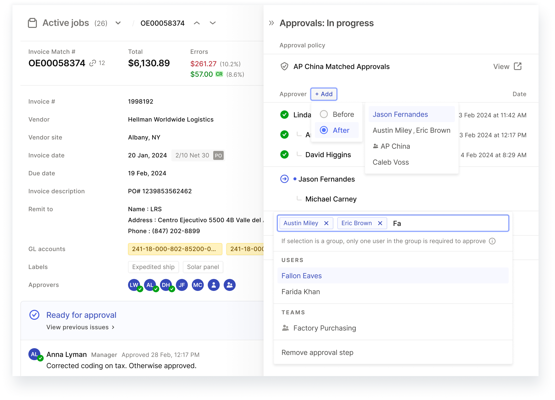
Image 2, Final Design: Users can now add, reassign, or remove approvers in just a few clicks—no support needed.
RESEARCH & INSIGHTS
Customers need control, not confusion!
To better understand the problem, I combined several research inputs—speaking personally with users, gathering feedback from Customer Success/Sales, and analyzing support tickets. Through this, I identified three key insights:
Key insights
1
Users struggled to understand approvals and how to take action.
“How are ‘In approvals’ and ‘Review & approve’ statuses different?” — AP Clerk
Approval issues accounted ~50% of mid-market support tickets, exacerbated by more manual workflows compared to enterprise customers.
2
Sales reported approval limitations as a major hurdle for prospects.
We received 1-2 feature requests per month relating to approval limitations that were encountered during calls with prospects.
A $110K ARR deal was lost due to missing ad-hoc approval actions.
3
Competitive analysis confirmed feature gaps.
Our system lacked industry-standard actions like Add approver, Reassign approver, and highly custom policy overrides.
Competitor research and user interviews showed approval CTAs should always be primary actions, whereas ours were often buried.
MEASURING IMPACT
Approvals built for growth—without the friction
While reducing support tickets wasn’t the primary goal, it was the clearest indicator of success. A fully functional approval workflow meant users could modify approvals seamlessly—without workarounds or support intervention.
Success was measured across three key areas, which we aligned on during early discussions as a product team. Addressing these areas not only improved the user experience, but also streamlined operations, accelerated revenue, and strengthened customer relationship, all while establishing a scalable foundation for future growth.
Areas of success
1
Fewer support tickets: Approval issues should no longer require support intervention.
Approval-related support tickets dropped to 0–2 per week per customer, mostly tied to onboarding.
Business impact: Freed up support teams to focus on higher value retention and onboarding initiatives.
2
Frictionless approvals: Users should be able to resolve approval issues without confusion.
After launch, Customer Success saw rapid adoption of Add / Reassign features, reducing support reliance.
Business impact: Faster approvals meant reduced payment delays and improved customer cash flow.
3
Stronger Sales pipeline: Approval limitations should no longer block deals.
Sales stopped reporting missing approval functionality as a deal-breaker.
Business impact: Fewer objections, smoother sales cycles, and faster deal closures.
SOLUTION
Designing for clarity, flexibility, & scalability
As lead designer, I owned end-to-end design of this initiative—from defining workflows to final handoff and implementation.
I collaborated closely with engineering to validate feasibility and refine the solution. Early iterations were adjusted based on technical constraints, ultimately leading to a simpler, more scalable approach than originally envisioned.
The solution focused on three key improvements:
Transparent approval details.
Clearly display who approved, who is allowed to approve, when, and under what policy.Intuitive and persistent approval actions.
Make actions like Approve, Reassign, and Add approver easily accessible.Simple logic to reduce confusion.
Streamline approval UI across user types and jobs statuses
Transparent approval details
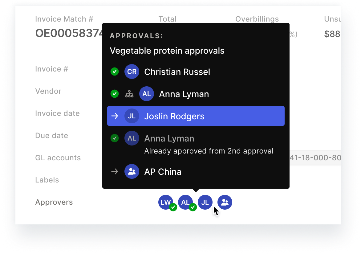
Image 3, Final Design - Approval Sidebar: Clicking the facepile reveals all approval details—the approval policy, full approver history, any modifications, and more—without overwhelming users. Progressive disclosure ensures complex information remains digestible using sidebar and tooltip patterns.
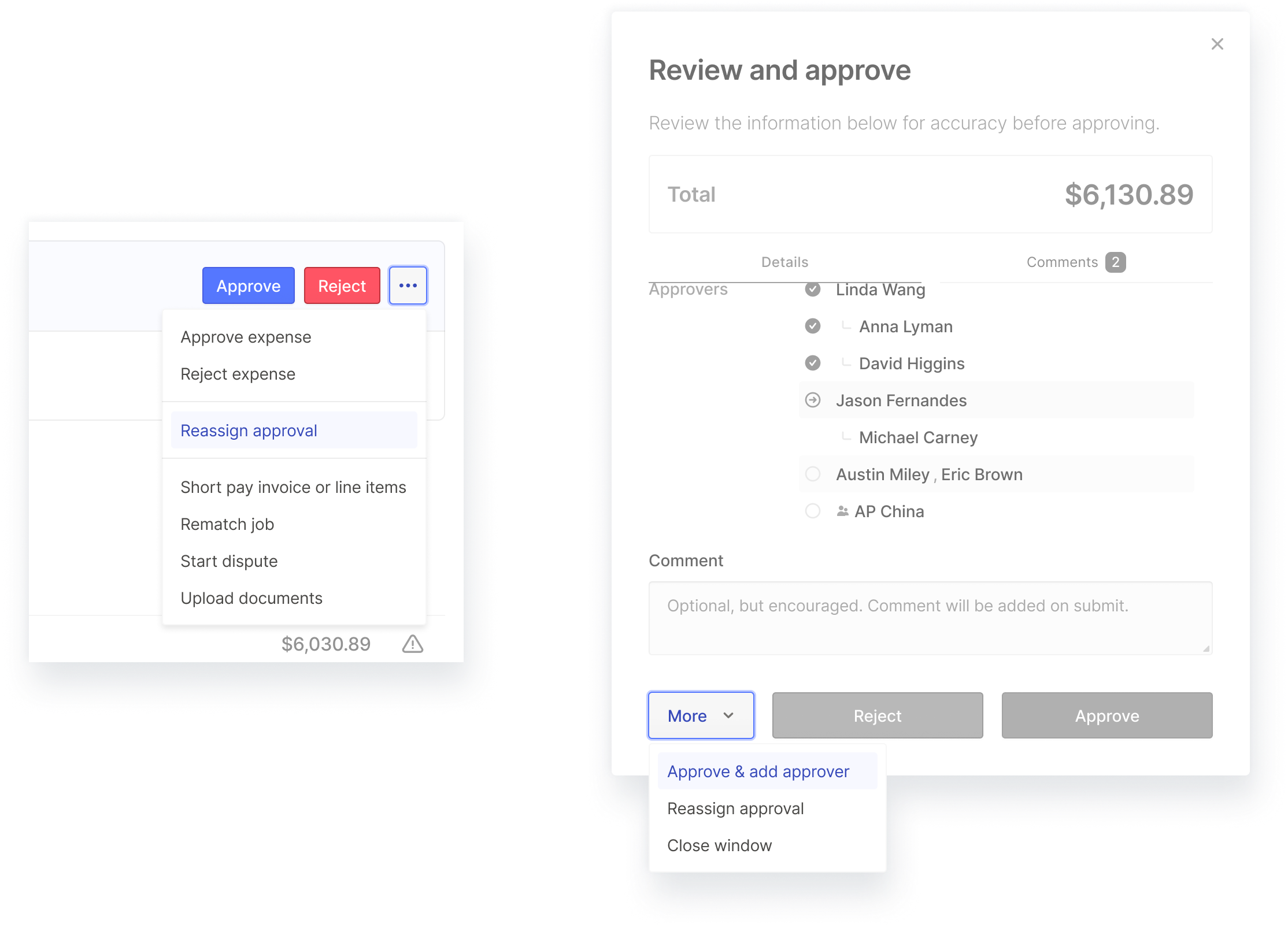
Image 4, Final Design – Approval Modal: The new approval patterns extend across key touchpoints throughout the approval workflow, providing consistent visibility into approvers and approval history.
Image 5, Old Design: Previously, only approvers and their approval status were shown. Minimal details left users without critical context on why an invoice was routed a certain way and any additional details about the approvals.
Image 6, Design Option: Early on, I explored expanding the existing UI to reduce engineering overhead. However, this design was dense, hard to scan, and difficult to scale for future enhancements.
Intuitive and persistent approval actions
Image 7, Final Design - Approval Sidebar Actions: Robust editing actions are available directly within the approval sidebar, including Add, Reassign, Remove, and Edit approval policy. These persistent controls allow any user to make adjustments.
Image 8, Final Design – Approval Actions Across Workflows: Approval actions are integrated across workflow touchpoints. Approvers can seamlessly make edits such as adding or reassigning approvers without additional clicks.
Simple logic to reduce confusion
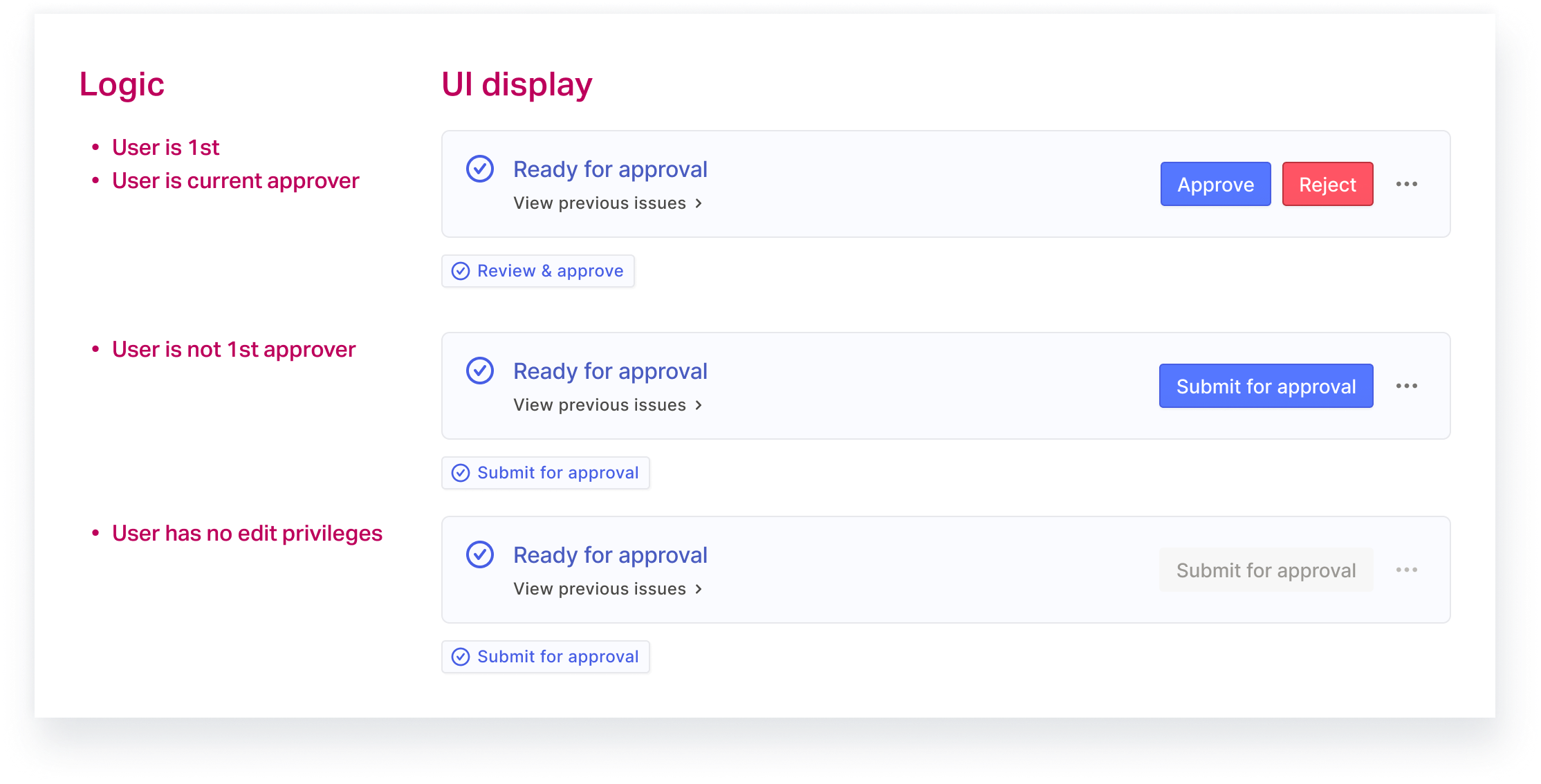
Image 9, Final Design – Streamlined Status UI and logic: The updated status logic is simple and binary with only 3 UI variants, minimizing cognitive load and streamlining testing, while maintaining essential approval controls. Clearer, more explicit CTAs help users quickly understand and take the next action.
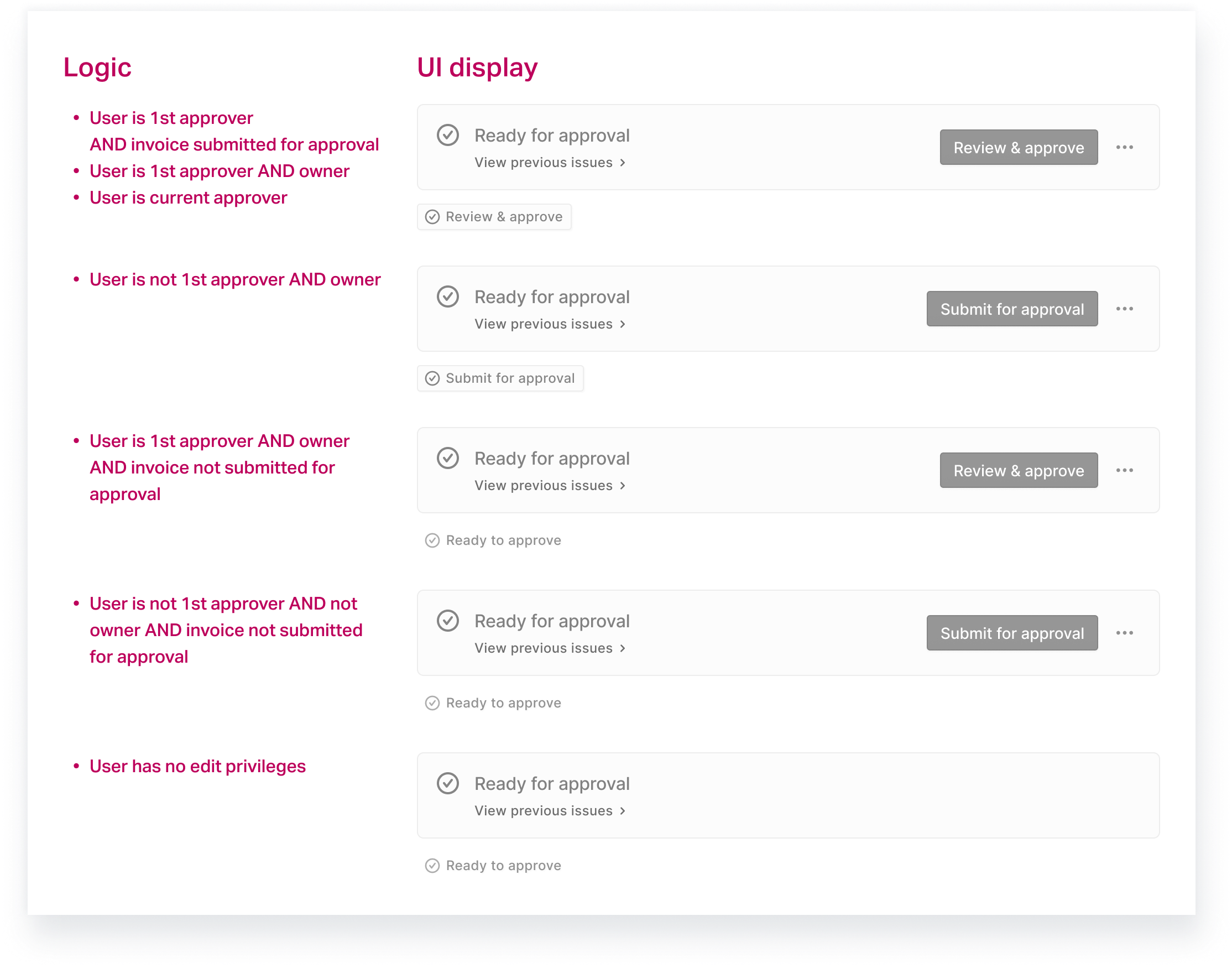
Image 10, Old Design – Overly Complex Status Logic: The original design relied on multi-conditional logic with 5 different UI variants, making it difficult for users to interpret and even harder to explain. This complexity often caused confusion, slowing down approvals during critical phases like UAT and production.
Making strategic choices for long-term impact
To balance usability, engineering feasibility, and long-term adaptability, we made key tradeoffs:
Redesigned UI using the sidebar pattern instead of expanding old UI
The existing UI wasn’t scalable for increasing complexity. Redesigning the UI within the sidebar UX would support future complexity and reinforce the sidebar as a core interaction model, which had been introduced as a foundational pattern. With new features already leveraging this approach, engineering was well-equipped to build efficiently.Triaged “Return to original approver” and “Not mine to approve” actions
While these functions were flagged during competitive analysis, no customers had requested it and decent workarounds existing in the updated UI. This avoided the complexity of 2 additional system states.Maintained structured approval controls over full customizability
Enterprise customers still require strict financial controls. Building in excessive customizability could lead to downstream compliance risks. Nonetheless, the backend was future-proofed for full customizability in the future.
RESULTS & IMPACT
Approvals today: clear, fast, and flexible
The redesign eliminated friction in approvals, improved self-serve abilities, and established a scalable foundation for future iteration.
Users gained control & clarity
Customer Success observed customers seamlessly using the added approval features during syncs.Support ticket volume dropped
Approval-related tickets now 0–2 per week per customer and mostly related onboarding.Unblocked Sales
No additional feature requests for approval updates or customization since launch.Improved Engineering efficiency
The streamlined logic requires less QA overhead, making future iterations easierNow supports highly complex approval structures
The system successfully handles customers over 400 approvers, ensuring enterprise readiness.
KEY LEARNINGS
Users hate when they don’t have control
End-user flexibility matters—especially in highly automated environments
No automation is perfect, and when it fails, it becomes the user’s problem. This project reinforced my approach of designing for failure cases upfront so users always have a way forward.
Start with freedom, then add restrictions
We assumed finance teams wanted strict, locked-down approvals, but this led to an over-designed solution that was too rigid and complicated for many later customers. It’s better to start simple and layer on complexity as needed.User flexibility and control are a balance
Designing for enterprise complexity without overwhelming users is tough. This project reinforced the power of progressive disclosure, smart defaults, and clear UI signals to make intricate workflows feel effortless.
This project reinforced the importance of “just enough design”. Products and businesses evolve over time, and over-designing can limit future adaptability. The best designs solve immediate needs while keeping the door open for future growth.


