Role & Duration
User Research, Information Architecture, UX/UI Design, Prototyping, Testing, Strategy
8 Weeks
Overview
Toodledo is a task manager offering a robust, customizable toolkit. Its 50,000 users have the ability to organize everything from their personal lives to work lives to schedules. Since its launch 15 years ago, the product has focused on individual task management. Market and user research shows there is an opportunity for the company to expand as a business enterprise product.
Scope & Product Strategy
The First Step in Modernizing a 15-year-old Product for the B2B Productivity Space
When developing the product roadmap with the client, the collaboration redesign (Phase I) was prioritized over updating Toodledo’s outdated UI (Phase II) since collaboration is so essential for any B2B productivity tool. Phase I, the focus of this case study, intends to establish collaboration as one of Toodledo's key features.
Problem
How can we improve task sharing so users collaborate effectively?
Released in 2016, collaboration was added to, rather than integrated with, Toodledo. An underdeveloped information architecture and user experience challenged fundamental usability. Not surprisingly, usage data revealed the feature went mostly unused. I believed an increase in engagement, shown by an increase in number of invites to collaborate and tasks being shared, would be a strong indicator of success.
Solution
Shared
Workspaces
An intuitive, shared repository for collaborators to organize, delegate, and complete tasks.
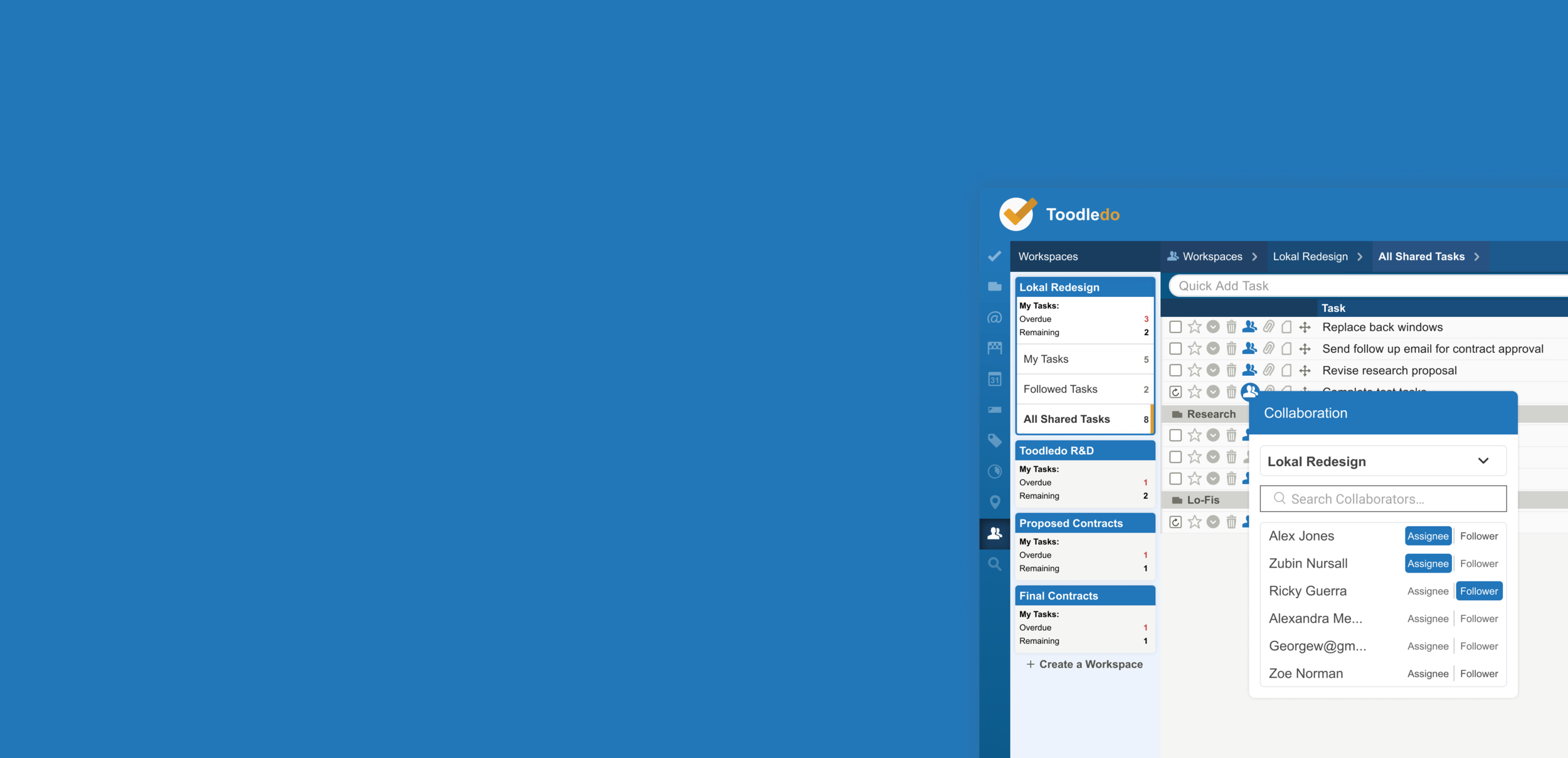
Organize collaborators based on how your business works
Shared workspaces has you covered, whether working with one or several groups of collaborators.
Unbelievably easy collaborator onboarding and offboarding
Start sharing tasks right after inviting collaborators to a Workspace. Preset user types make permission setup a breeze.
Automatically organized tasks so you stay focused on doing
Tasks automatically sort to their assigned Workspaces to minimize clutter.
Process
Inquiring +
iterating
Exploration & discovery, divergence & convergence
Research
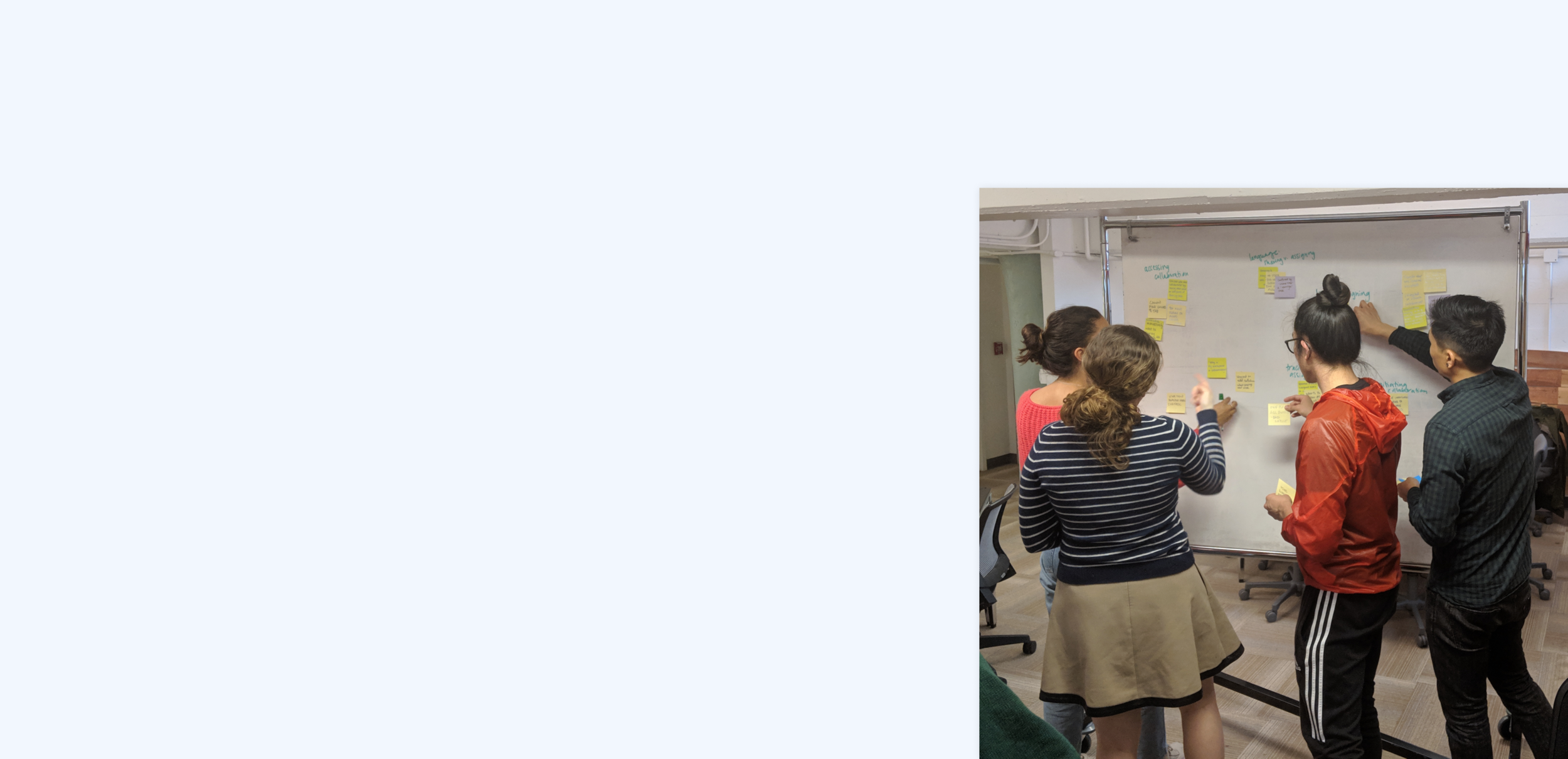
Sharing Tasks and Managing Collaborators should be Painless
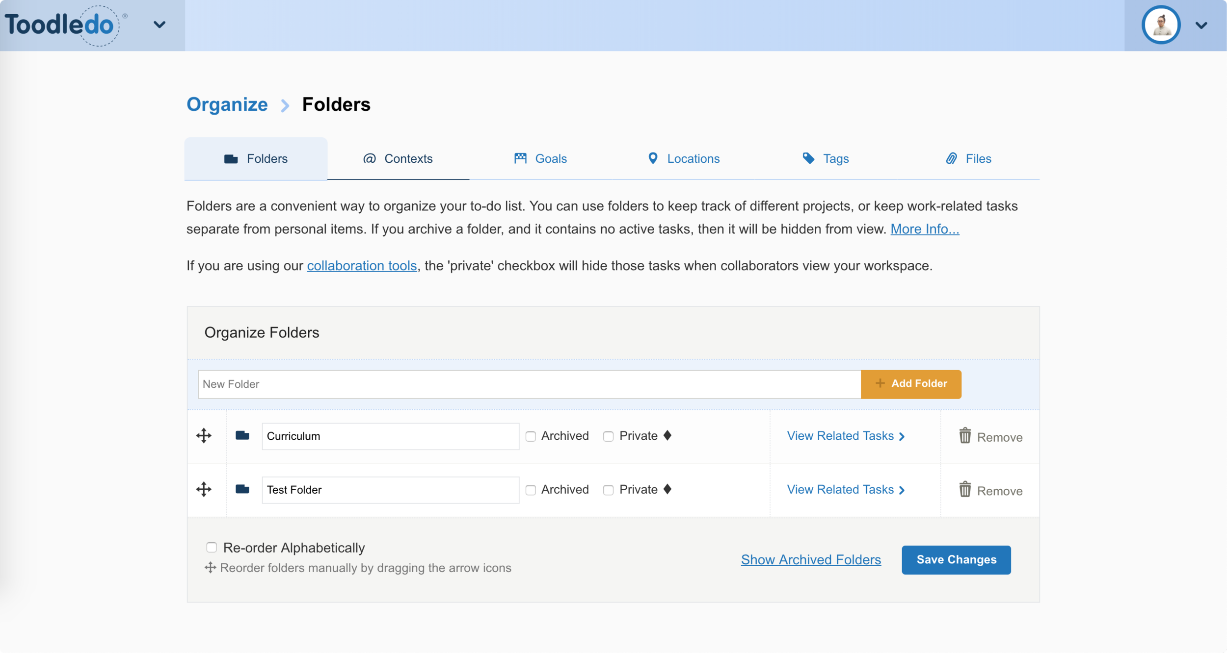
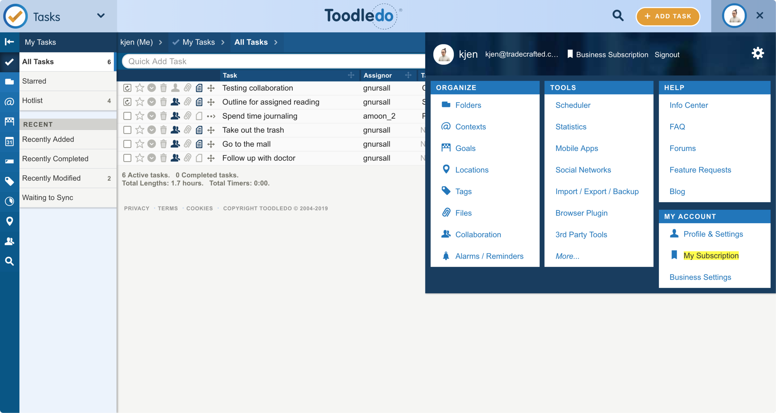
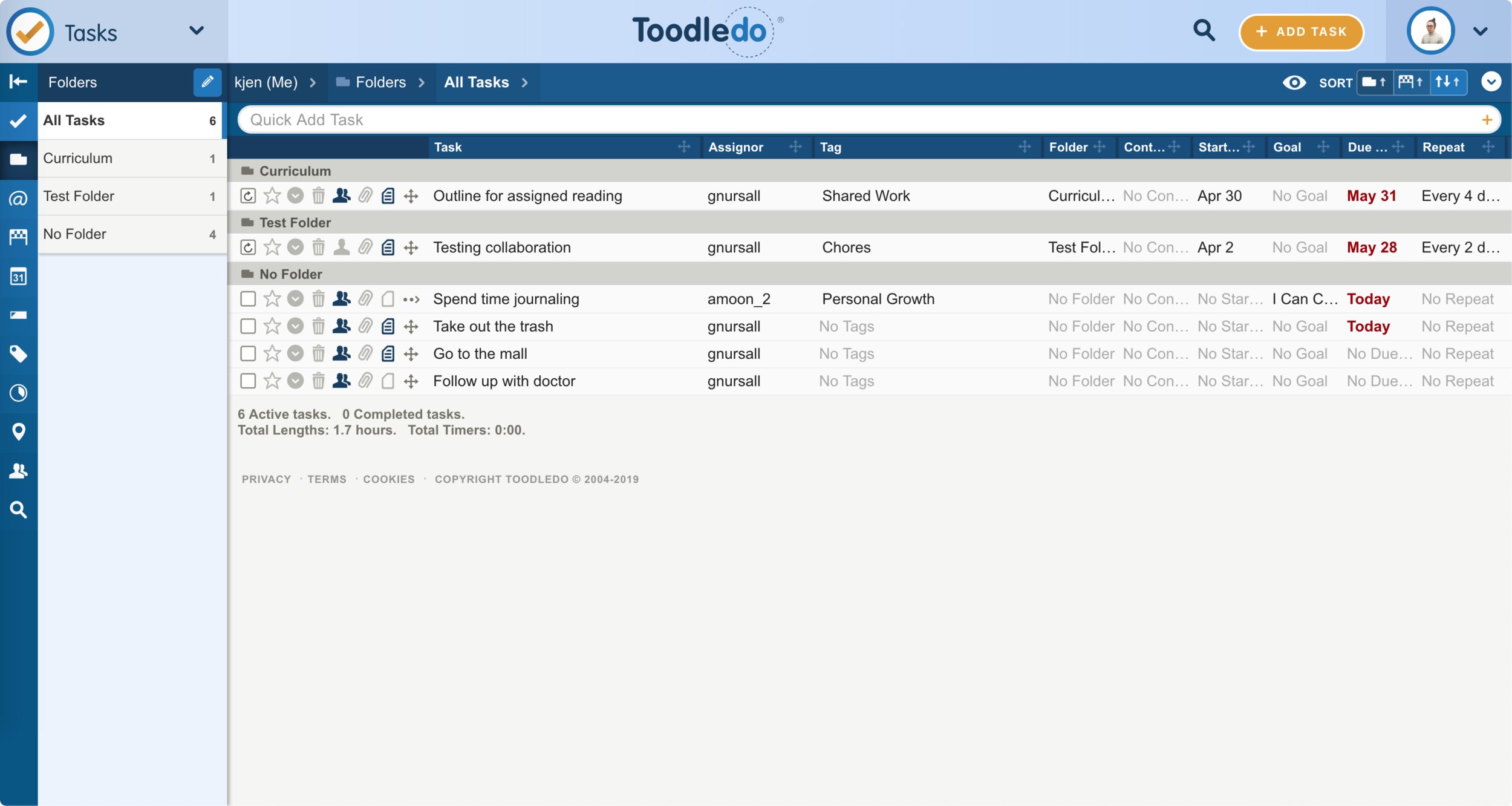
With 13 different fields that can characterize tasks, gaining a deep understanding of Toodledo’s existing information architecture was critical. It became clear the product was using esoteric and outdated patterns based on my competitor and comparator analysis.
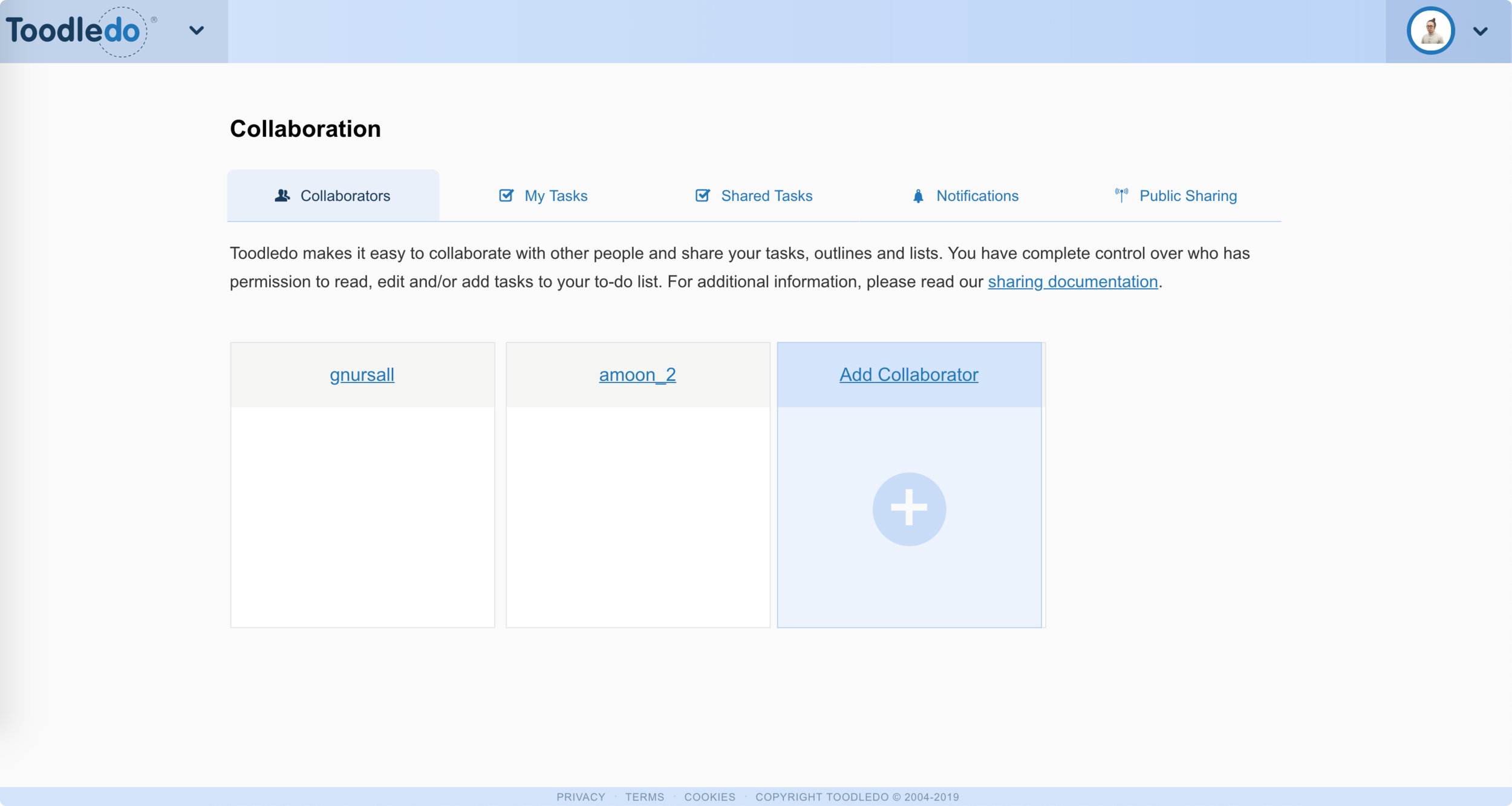
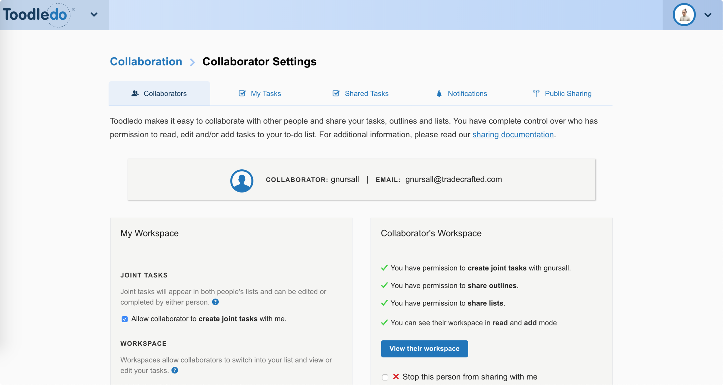
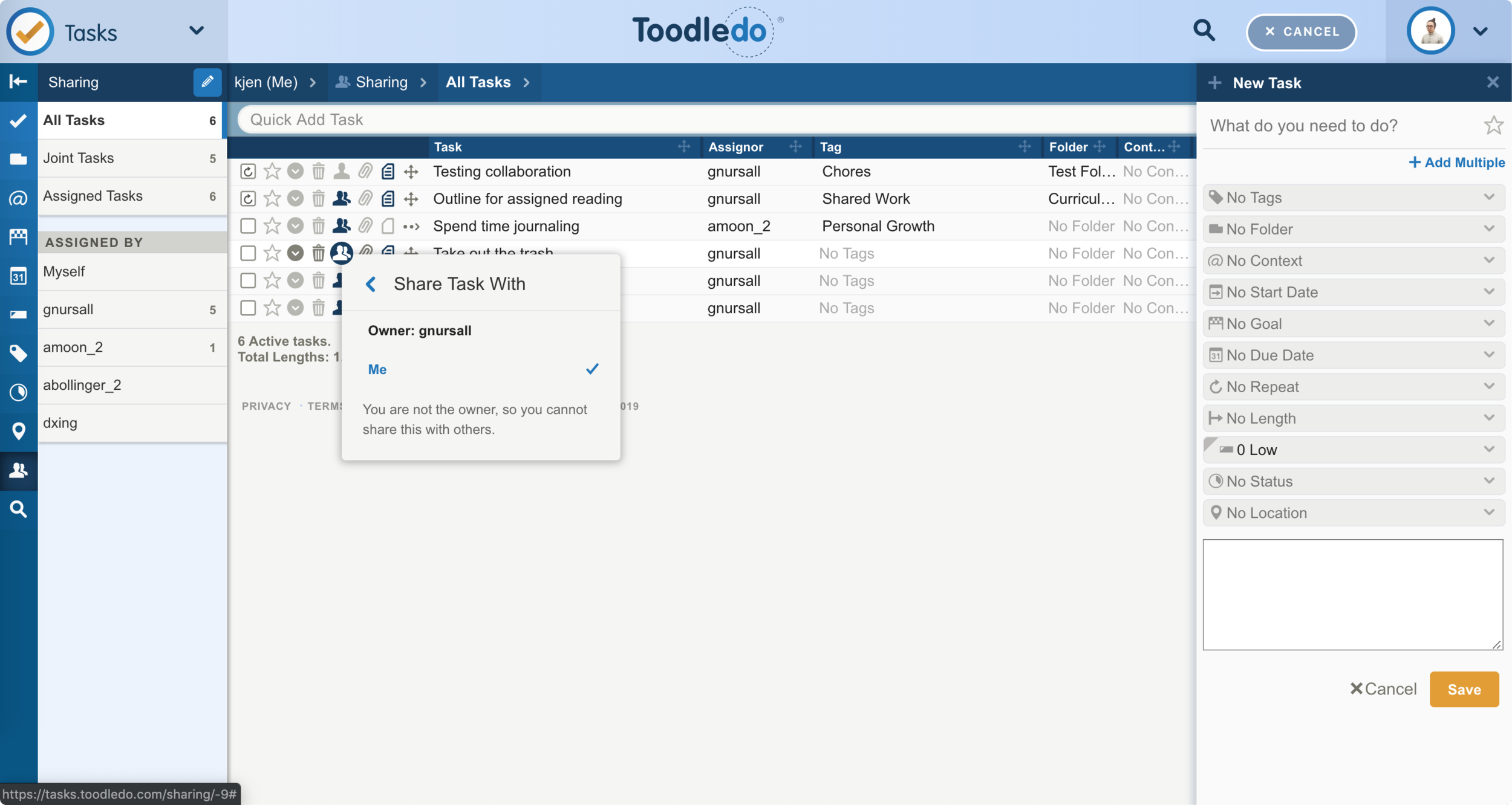
I also conducted 8 usability tests of the product’s existing collaboration feature with new and existing users. Only 1 existing user used the collaboration feature by employing workarounds. All others users struggled or were unable to accomplish tasks relating to setting up collaboration and collaborating on tasks. The full research deck can be found here.
Key Insights
Analyzing the data I gathered from research, I grouped insights into 3 categories that reflected the essential functionality of collaboration and identified where Toodledo was causing the most friction:
Shared Workspaces Overview
Developing a Structure for Diverse Business Needs
Ver. 1
The original feature required the user to share each task individually, yet users typically collaborated with the same groups of individuals in different roles. A Workspaces represents a repeat set of collaborators.
User Type by Tab, Numerous Workspaces
Iteration 1
The first iteration accounted for user types with tabs. However, the tabs weren't mutually exclusive to the user types creating confusion. Also, user interviews suggested few users would collaborate with more than eight groups, making the tabs unnecessary.
Ver. 2
This iteration removed the tabbed navigation and identified workspace permissions with pills. The card was also expanded to progressively disclose some information about the Workspace like outstanding tasks.
User Type by Pill, Outstanding Tasks
Iteration 2
Some quick usability feedback found users were confused by the pill and thought it was a button. Also, it visually conflicted with the Workspace name. I decided to remove oustanding tasks since Workspace management and real-time task collaboraiton are distinct.
Final
Businesses frequently consist of multiple groups of collaborators, but the original feature treated collaboration on a task-by-task basis. Workspaces provide the shared environment(s) that the original feature lacked to organize groups of collaborators and their tasks.
Intuitive management: being part of several Workspaces can get confusing quickly, so Workspace level actions (create, leave, archive, or delete) are accessible from the Workspace Overview screen where users view and manage their groups of collaborators.
Permissions by Workspace: permission levels are applied on a per workspace basis since team members can adopt different roles on different teams. The cards show an overview of team members' roles and the avatars will serve as an entry point for a future feature to track team member performance.
Managing a Shared Workspace
Creating the Best Experience for Users to Manage Collaboration
Ver. 1
Option 1
Option 2 (Selected)
I selected Option 2 since manage functions warrant the user’s full attention and the layout maximizes use of screen real estate. Containing the manage functions to a modal creates a seamless transition between active collaboration and managing collaboration while still differentiating the separate functions.
Ver. 2
Full-Screen Modal, Column Navigation
Final Lo-Fi
Final
To make Workspace setup effortless and reduce cognitive load, the Create Workspace flow onboards the user with step-by-step instructions. Previously, users read a dense screen of instructions to understand collaboration setup, a point of friction and confusion.
The Admin user type provides managers and admins necessary control and flexibility while the Editor and Member user types allow individual contributors to stay focused on their specific tasks.
Fast and simple setup: users can start collaborating as soon as they accept an invitation to a Workspace. The redesign simplifies the original flow by removing the need for users to mutually accept collaboration invites and then individually set roles and permissions.
Quick and easy removal: collaborators can leave a Workspace or be removed by an admin. The destructive action has an extra step using the Edit Team button and a confirmation. Previously, it took several steps from both parties to end collaboration, frustrating many users.
Set User Types and Permissions so Roles are Crystal-Clear
Three user types were developed from personas and user research. Based on roles and responsibilities in an organization, collaborators are assigned a user type. User types and corresponding permission sets can reduce ambiguity in task responsibility. The table below was also useful tool to communicate design intent to stakeholders and get their buy-in.
Key Learnings
Prioritizing the MVP
It was crucial to have a clear definition of Toodledo’s MVP collaboration feature. Since the collaboration feature redesign was the first step in Toodledo’s up-market evolution to B2B, it was easy to get sidetracked and overwhelmed by solving other problems. I stayed on track by constantly questioning if the problem I was solving was required for the essential functionality of collaboration.
Context and Constraints
Toodledo is a large and complicated product. Understanding the product from both a design and engineering perspective provided necessary constraints that helped determine what changes were feasible in the MVP and which ones were limited by legacy design patterns and engineering implementation. Even small changes had big ripple effects that I had to rigorously track through the product.
Balancing the Present and Future
I worked closely with the client to understand the future of Toodledo as a B2B product. The design needed to account for scaling and be able to accommodate future features that would build out the product’s enterprise tier. It was a challenge to account for the future while also making the design work at the product’s current stage of development.


